Question:
Draw a histogram to represent the following data.

Solution:
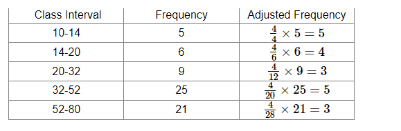
In the given frequency distribution, class sizes are different.
So, we calculate the adjusted frequency for each class.
The minimum class size is 4.
Adjusted frequency of a class $=\frac{\text { Minimum class size }}{\text { Class size of the class }} \times$ Its frequency
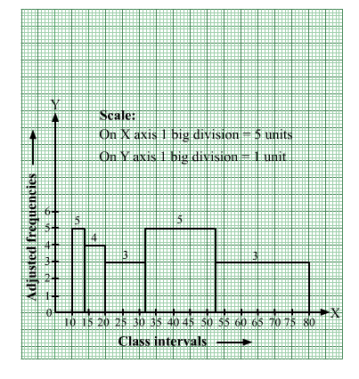
We have the following table:
We mark the class intervals along the x-axis and the corresponding adjusted frequencies along the y-axis.
We have chosen the scale as follows:
On the x- axis,
1 big division = 5 units
On the y-axis,
1 big division = 1 unit
We draw rectangles with class intervals as the bases and the corresponding adjusted frequencies as the heights.
Thus, we obtain the following histogram: